Sveriges førende trendekspert Trendstefan har atter været i Paris til Maison & Objet. Her kan du læse 1. del af hans reportage fra messen og få føling med, hvilke trends vi kommer til at se.
Paris, mon amour. The interior design fair Maison & Objet and Paris Design Week had almost all halls open for the fall edition. Plenty of people and I would say the majority of the people were extremely happy. I haven’t seen the official numbers but here is my report. I heard there were over 2 500 exhibitors. We can conclude that we more and more are heading into some kind of 1980s mood. Get ready for 80s colours (lion’s yellow), pattern, contrast with black-and-white and aesthetics from the era.
So, trends.
Patterns on patterns
Lets start with the obvious. You should have seen it already on various social media. But we will see plenty of patterns.
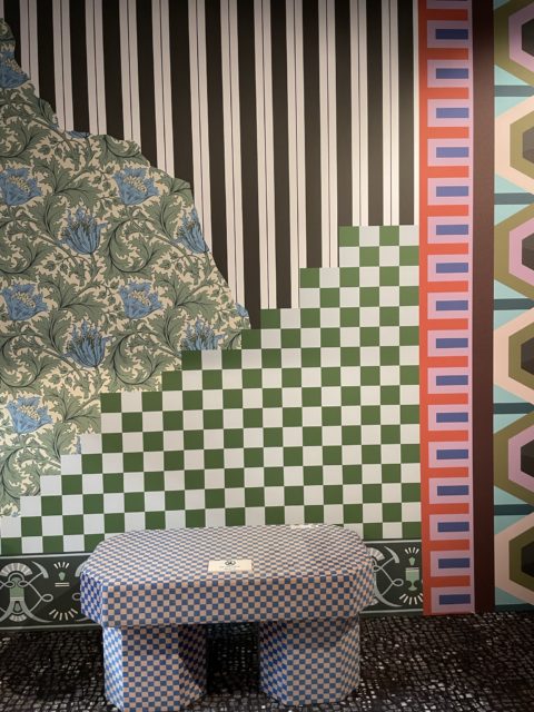
At the trend exhibition at the fair, we could see several installations where patterns were basically stacked on eachother. Like we can’t get enough. Nothing is right – and nothing is wrong.
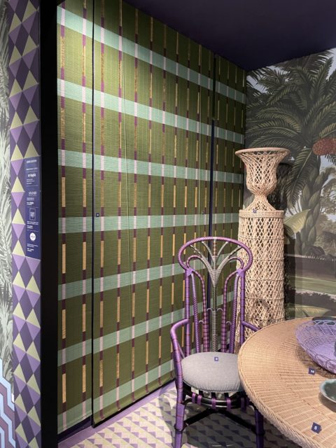
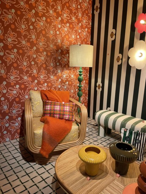
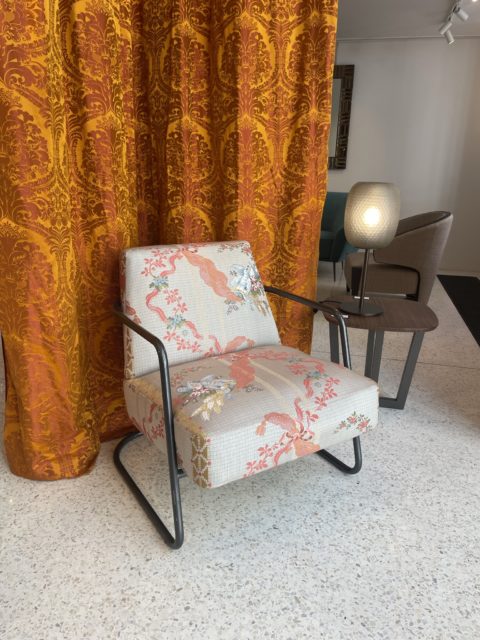
There weren’t so many exhibitors falling into this trend – but we could see it on town during what is called Paris Design Week. Here Rubelli. Total clash. But nice.
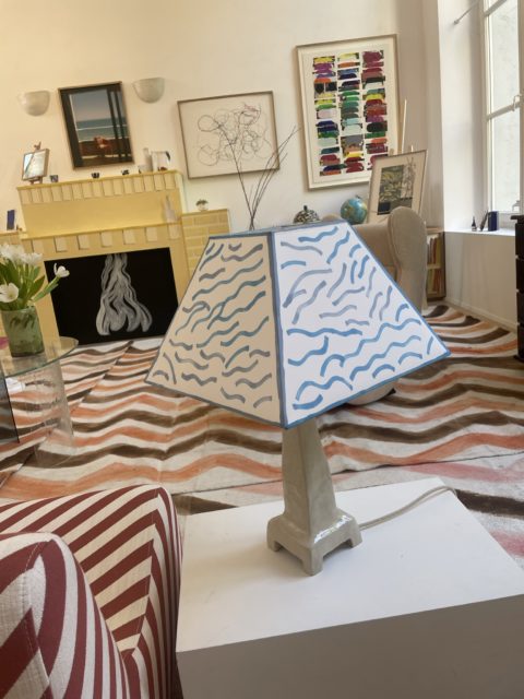
One of my favourite installations was the one at Amelie Maison D’Art, They had taken a painting by David Hockney and made furniture from the painting. Or interpretations. Very 80s and also patterns on patterns.
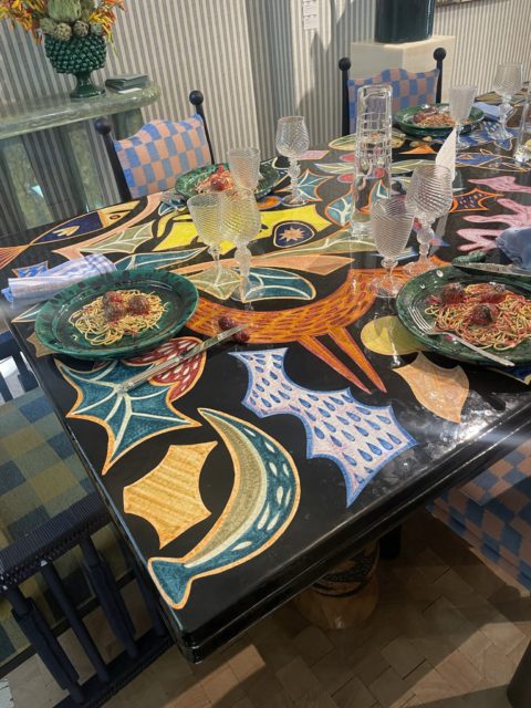
Lovely Laura Gonzales also worked in this theme. Notice the table with the plates and the chairs and the wallpaper…
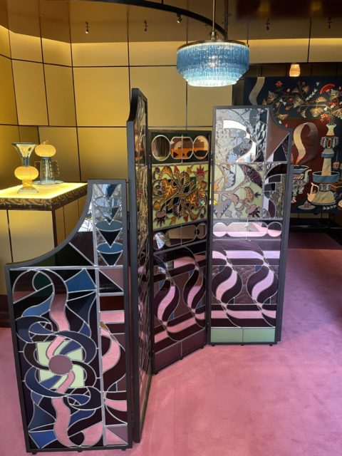
At Galerie Pierre Marie. Beautiful wallhung rugs with room dividers with glass patterns.
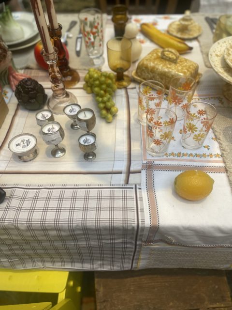
Also at Merci. Here they worked much more on a kitsch theme. Old plates with handkerchiefs sawn together as a tablecloth.
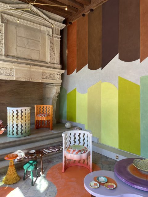
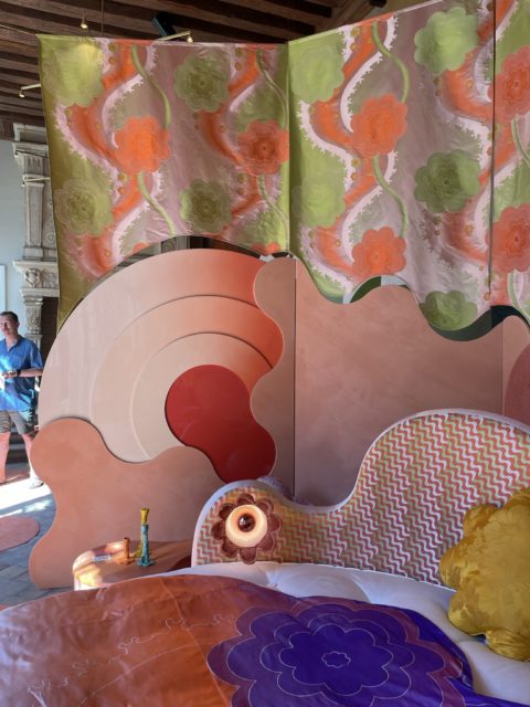
Last but not least, most talked about installation by architects at Uchronia. It looks thrown together but look at the dye effects and how curves match eachother. Super crafted. And lots of colours and patterns.
Black and white with strong colours
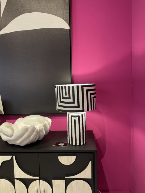
Yes, also an 80s reference. This black-and-white but together with a strong colour. In this case not so much pattern but focus on just colour.
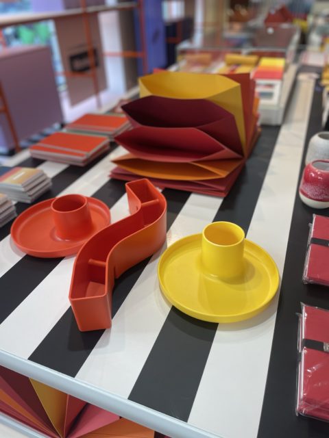
Table at Conran Shop.
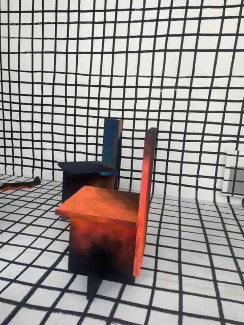
Matthieu Lemarie with GGSV
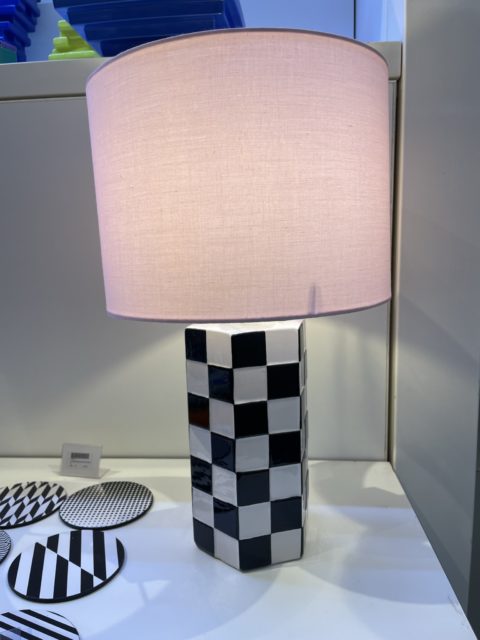
At &Klevering
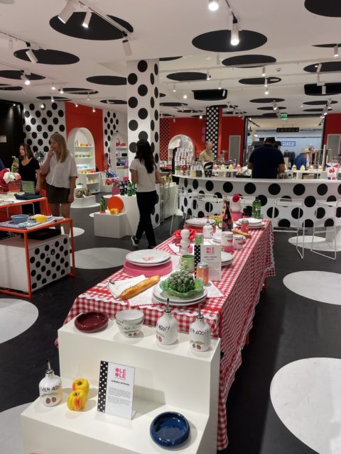
Not only stripes – also polkadots. Here at Le Bon Marche.
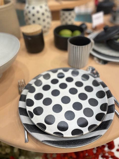
Here at Portuguese ceramics brand Maria Portugal Terracotta
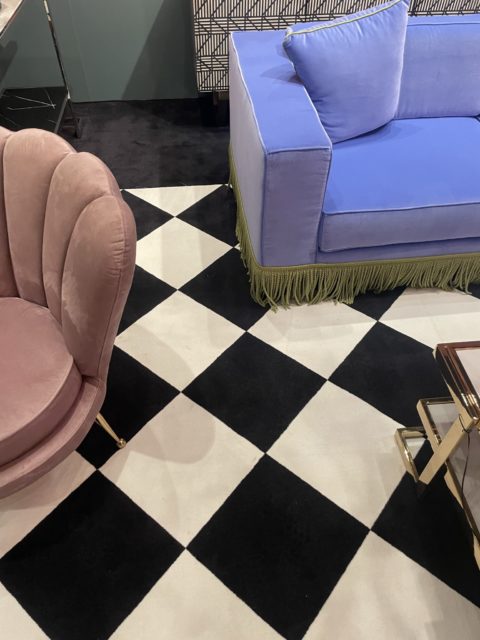
But in general – more floors like this with exhibitors.
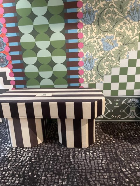
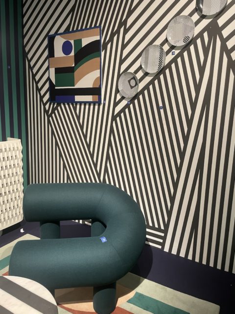
Last two pictures from the trend installation at the fair.
Yellow
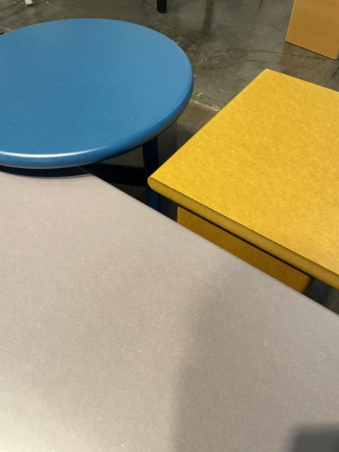
Yellow is also an 80s reference. Especially this darker yellow. In Swedish we call it “lion’s yellow”. Not as dark as mustard. Here at Cruso.
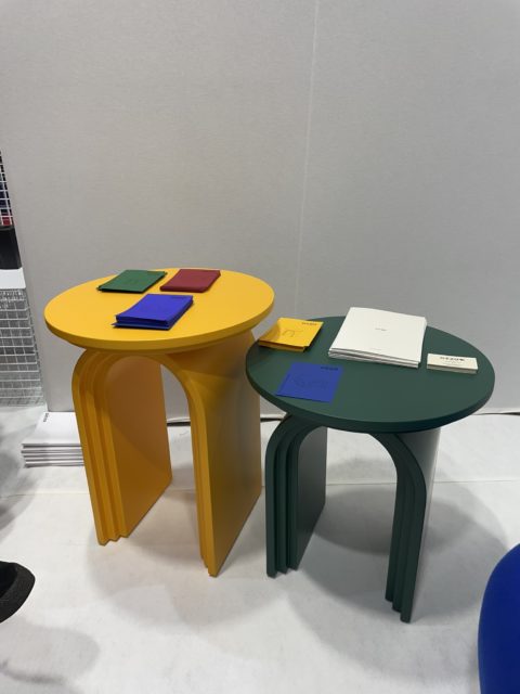
This lion’s yellow go well with all darker tones. Like a dark blue or oxblood. Here Ukrainian brand Diza.
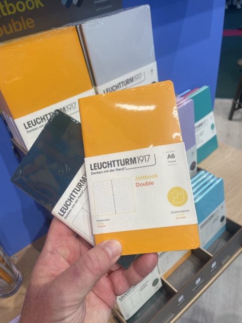
Notebooks at Leuchtturm.
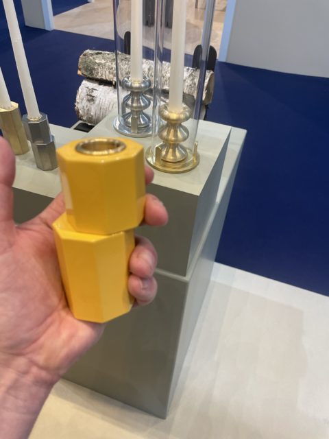
Candleholder at Eldwarm
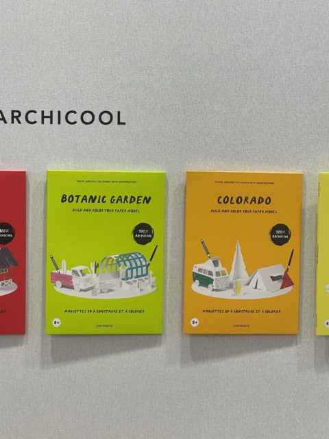
But as my trend colleague Alina say – you should add a chartreuse to it. Then it feels much more updated. We saw it also at Uchronia.
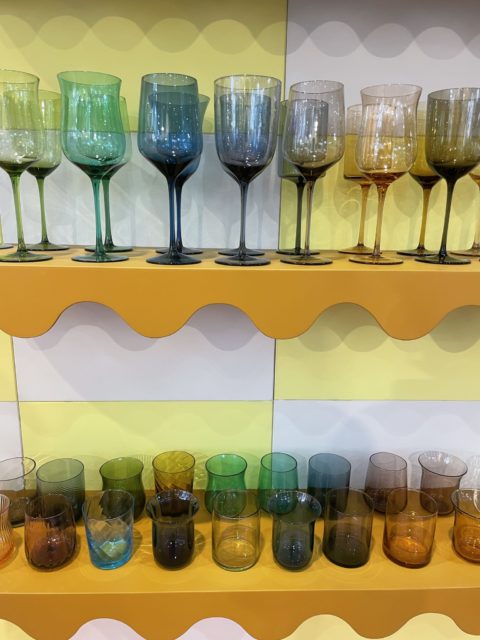
Bitossi Home
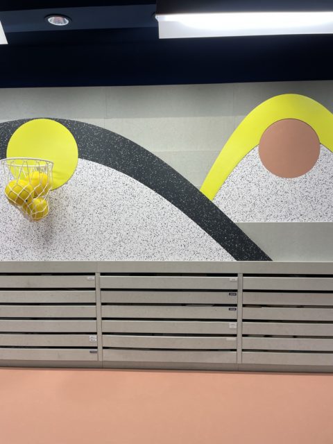
Tarkett
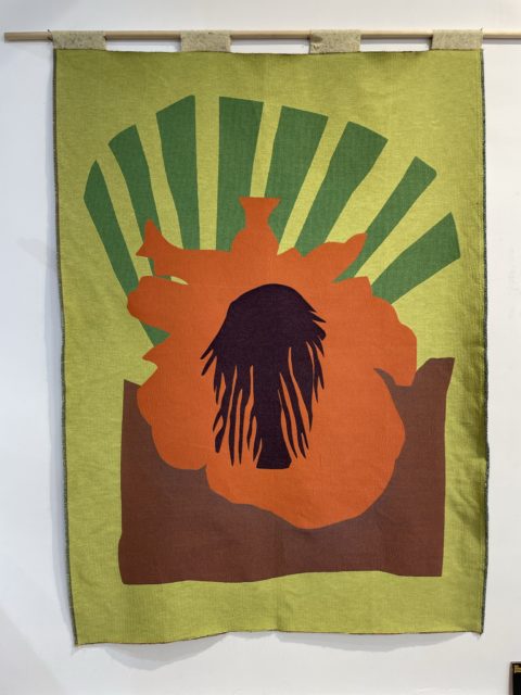
Manuel Leromain
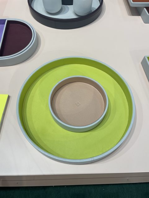
Giobagnara
Reportagen fortsættes…..


