Fra den 19.-27. oktober løb Dutch Design Week af stablen. Besøg eller genbesøg den hollandske designuge sammen med den svenske trendekspert Trendstefan.
Dette er anden del af Trendstefans rapportage.
So, the last post on Dutch Design Week got a bit too serious. I need to lighten things up with colours and fun. I mean the design concept can both be about saving the world AND have a colourful Wednesday.
Colours
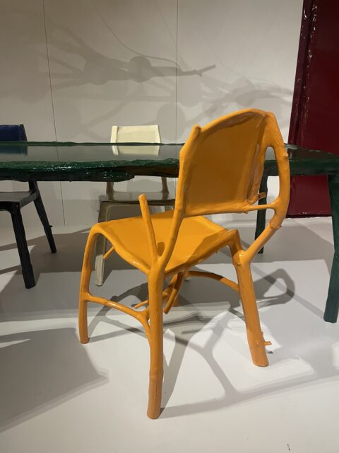
Perhaps an overlap between serious and fun? Teun Zwets make furniture of waste wood and pours paint over it. But this burned yellow that is just between yellow and orange is nice. A colour that really stands out. Do I like it or not…? Not sure.
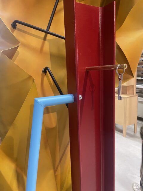
This is the same colour you could see at Kiki & Joost.
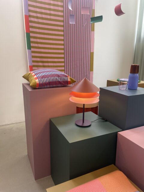
And as expected with Raw Color. Match this dark yellow/orange with burgundy and emerald green. Or is it actually racing green???

More classical orange but with this green with Show Not Show at De Kruisruimte.

I just love the glass chandeliers by Nienke Sikkema made at the production site at Piet Hein Eek.
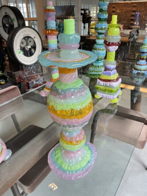

Mint green chair at Dutch Invertuals by Max Lipsey.
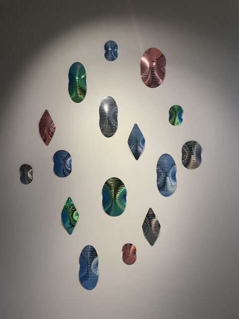
Green and metallic at Kazerne with this “mirrors” by Martens & Visser.
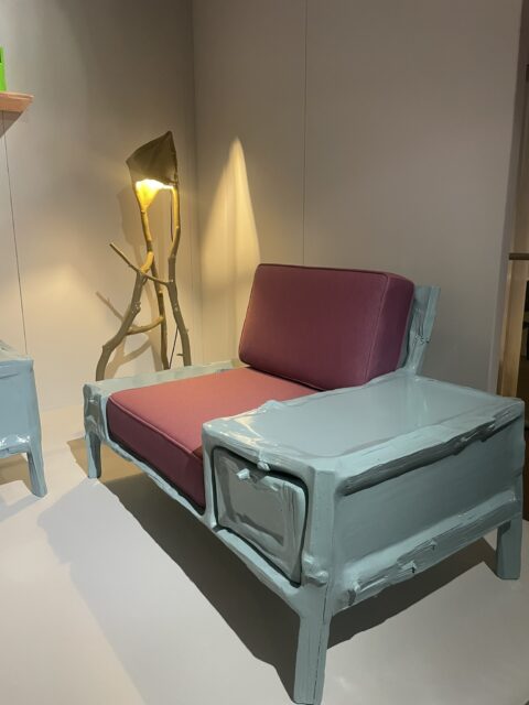
Teun Zwets again, and you see the combination of minty green with burgundy here too.
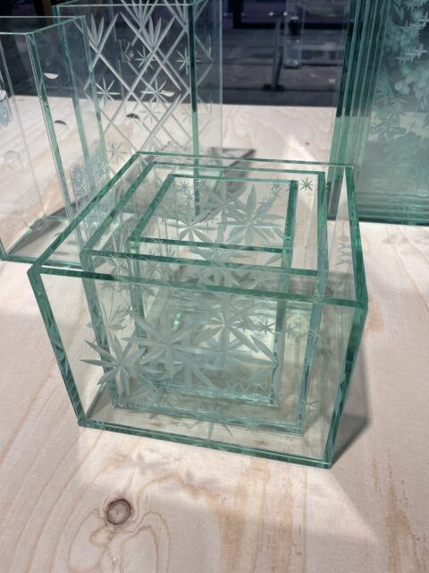

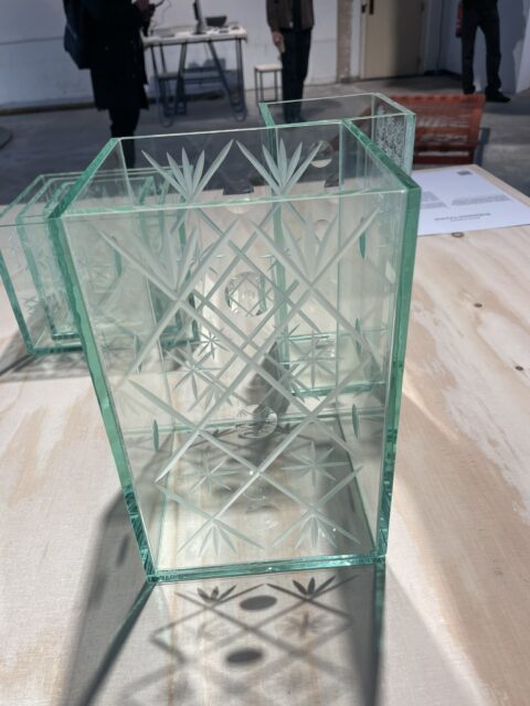
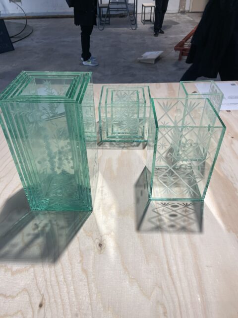
And one of my favourites from Design Academy. I just love the easiness of this. Flat glass. Someone said it was recycled, but it doesn’t matter. I just love how you create this depth in the images with these stacking of vases on top of eachother. So nice. Student is Marie Kolarova.

This light smurfy blue is also here. Look at the picture from Kiki & Joost. It is the same kind of blue but here with a burgundy/brown. Here at Dirk Duif.
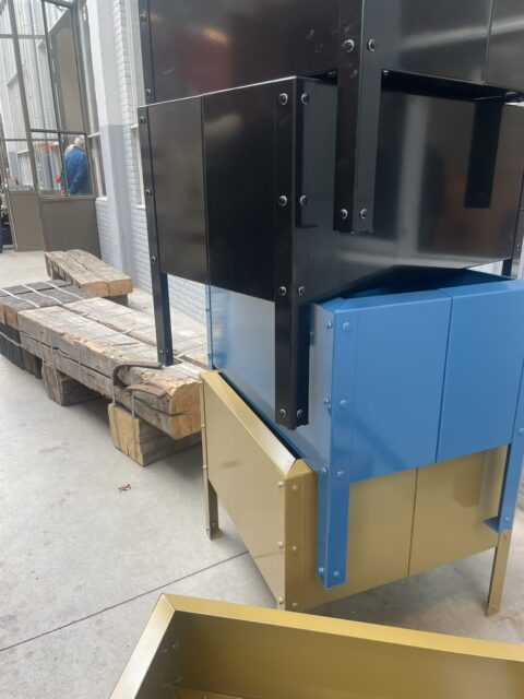
Same baby blue at Piet Hein Eek
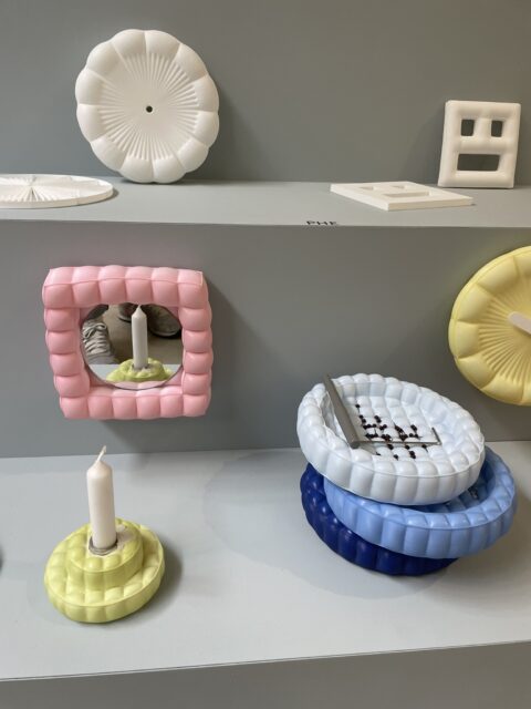
I talked about Leo Koda yesterday and of course you see a kind of baby blue with him as well.
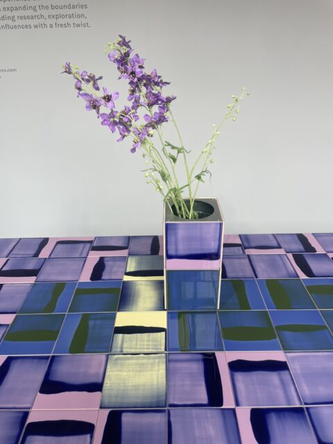
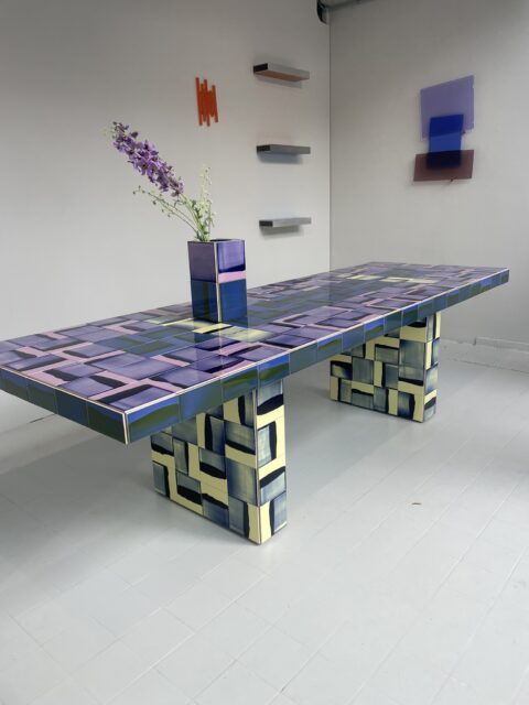
Versions of butter yellow. Here at amazing Studio Rens
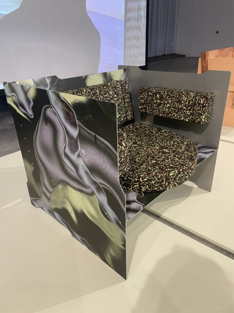
At Dutch Invertuals.

Designer Sho Ota.

At exhibition with collectible design called Crashlanding.

Same exhibition
Raw wood

You could absolutely say that we saw a bit of wild and raw nature. Like above and below from Craft Council Netherlands.

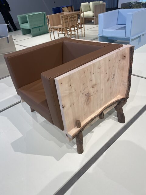
But also at Dutch Invertuals. Here by Willem van Hooff
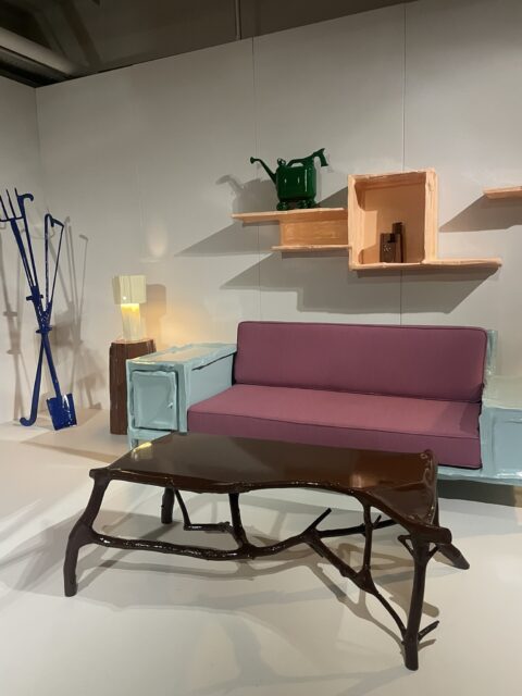
And again by Teun Zwets
Other things that were just plain nice
.
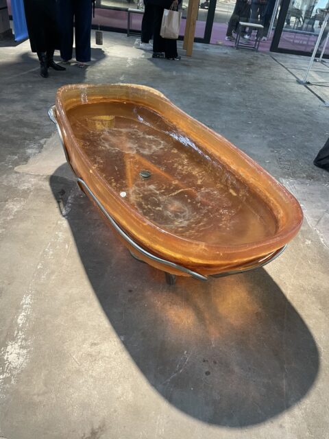
But other fun things. This bathtub!! When you fill it with hot water it get soft. It’s like bathing in a womb. Straaaaange. By Line Dnasdotter Murken at Design Academy.


In my trendreport for 2026 I will have a section where we look at historical craft traditions. This would fit. Design student Margarita Ivaylova Rangelova look at Hungarian needlework and ceramics.
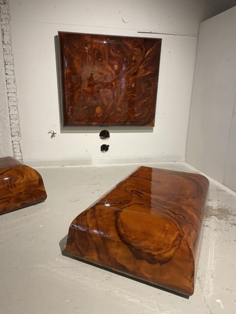
Perhaps a bad picture but I liked the concept. As I understand it, this is wood imitation and lacquer work. What I liked was the size. Pretty big pieces. By Lotte Schoots.

Wobbly bookshelf. The metal fram changes depending on the weight. Design student Marie van der Kroft.
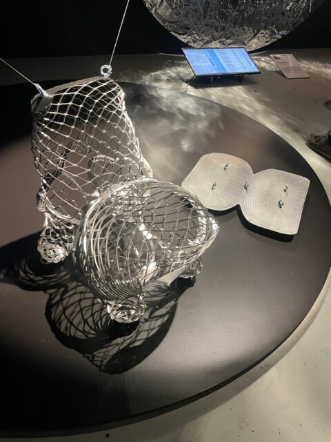
Flat package. Govert Flint made this chari. Pull the ends and make the shape you want.
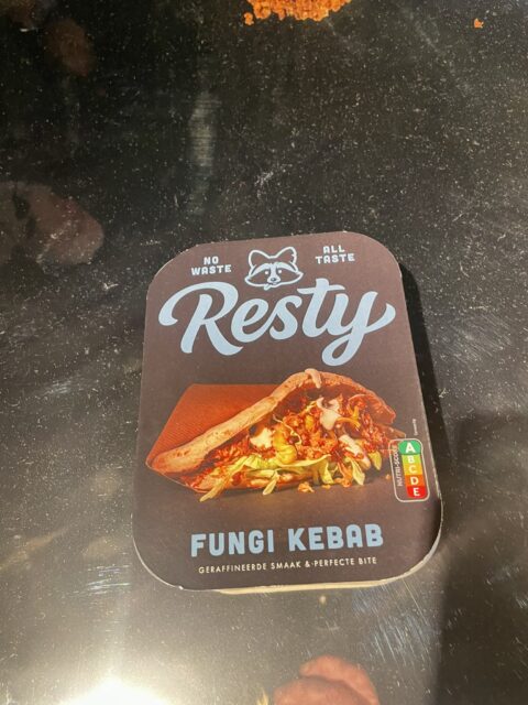
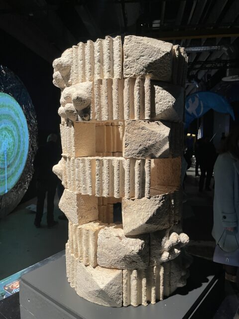
Just wanted to include some funghi. Lots of experiments with mushrooms at Eindhoven.

A beautiful pavillion made of bamboo. And as we know – this is a super sustainable material.
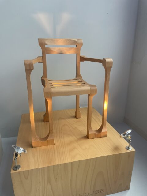

At Piet Hein Eek I found Kokke. The studio took up the work from Ruud-Jan Peters that made this chair in 1999. Regardless if it is “retro” or not – super nice looking.

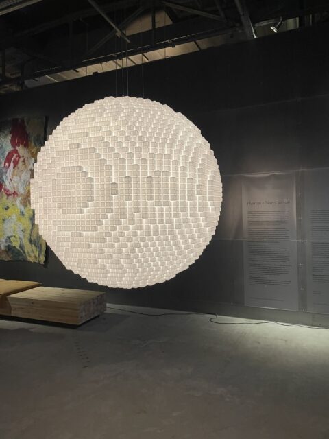
Just a gorgeous lamo at Kazerne. Comes in different sizes.

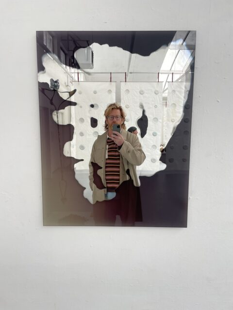
Mirrors by Studio Thus That at Craft Council Netherlands.

Several nice pieces of collectible design at Show Not Show. Studio Luuk van Laarhoven
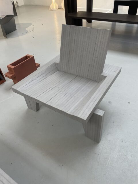
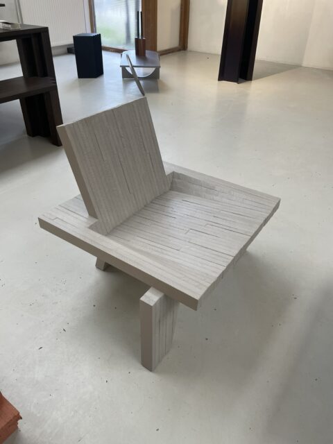
Brutalist chairs by Marc Meeuwissen
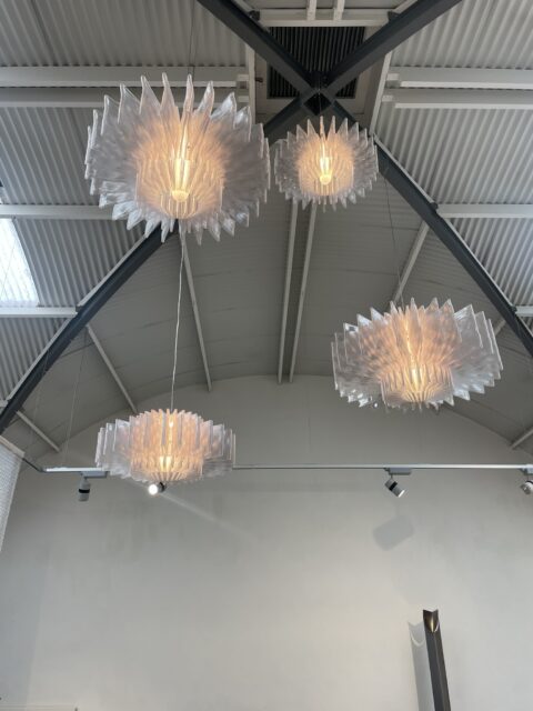
Lamps by Lucas Zito, apparently 3D printed in a biomaterial.
Tekst og billeder er lånt fra trendstefan.se


